

Illustration, Print Layout, Web Design, Copywriting

reinventing the (notes) wheel
As a huge coffee fan, this was a total dream project for me! It was a pleasure bringing the vision of this coffee notes wheel to life for Three Keys Coffee, an amazing Black-owned and jazz-forward craft coffee roaster based right here in the Bayou City. When co-founder Tio Fallen hit me up and asked me how we can take this complex, theory-dense asset to the next level, I knew that color would be a big part of the process.

The client and I both wanted the graphic to feel very intuitive and easy for the brewer to parse, since note wheels are notoriously subjective and sometimes difficult to understand; subsequently, choosing the appropriate colors for each flavor category from character to intensity was the most crucial (and interesting) part of the process. What color does “vigorous” feel like? Is “tinny” black or gray? How far apart are “reedy” and “spirited” on the color spectrum? These are all questions I asked myself when looking at 3KC’s notes and determining the colors for each part of the wheel.
This sort of color analysis also helped me determine the best colors to choose for the sound + texture circles on the spectrum underneath the wheel, which is meant to provide an additional guide for brewers and drinkers who look for specific flavor profiles on either end of the spectrum, whether they like their coffee as green as a field in springtime or as dark as a rainy fall day. I leaned heavily on the use of gradients to communicate how close all of these different flavor expressions are to each other. Despite how different they may seem at first taste, all of these flavors are connected and come from the same delicious bean; it’s the roaster who determines which one jumps out at you first.

guiding the brewING and the sounds

I also had the chance to create brewing guides for their website with accompanying PDFs for people to download and follow at home. Using strong, detailed photography and a clean layout to accompany each step made the guides easy and intuitive to follow.
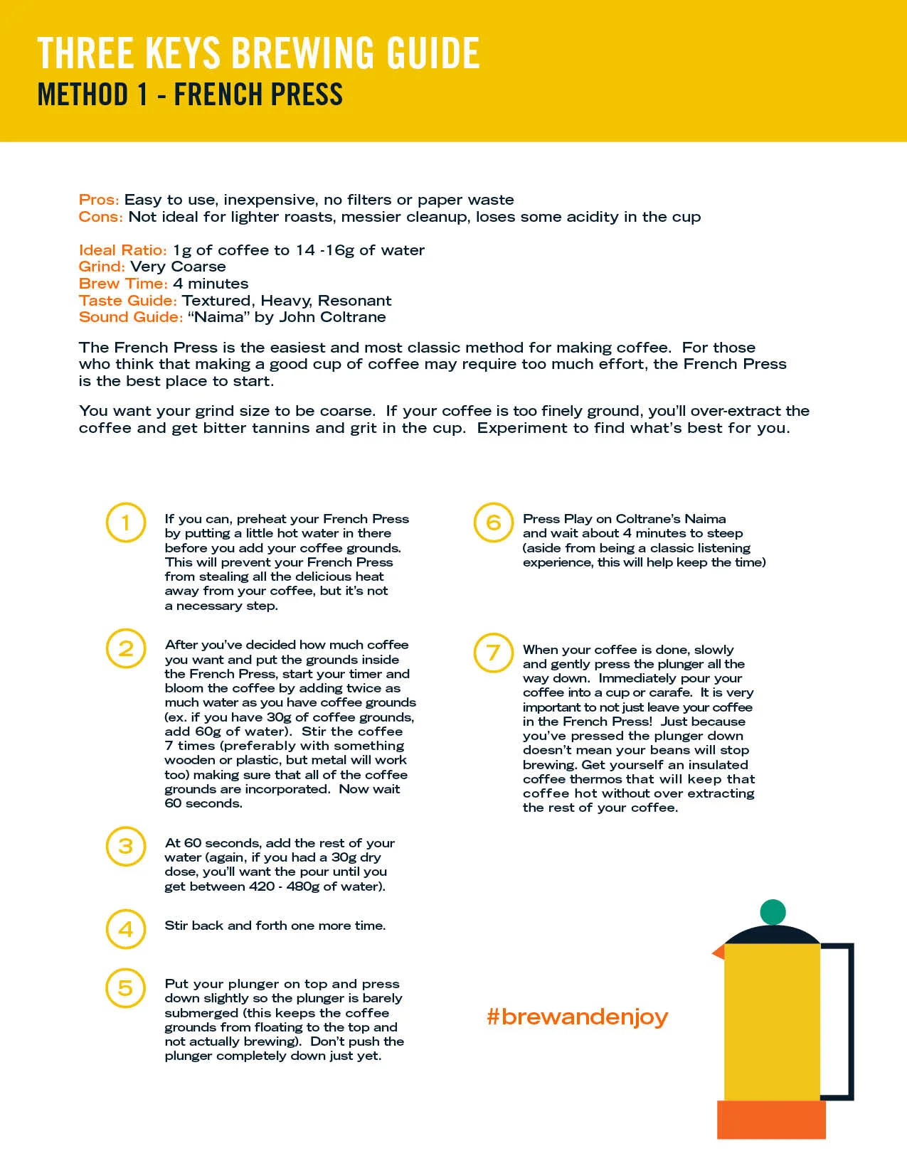
Making the PDFs similarly minimal and smooth helped make both resources feel like part of a cohesive set while also being able to live independently from each other. I also created some abstract, shape-based illustrations to accompany each brewing method and bring some contrast to each page.

Lastly, I did some light copy work on each page based on the sound guide recommendation for each brewing method, which was a really fun way to give the assets some of that vibrant Three Keys personality and flair. The combination of the copy with the illustrations brings some levity and brightness to the page, reminding you that it’s all about having fun and vibing off the flavors and notes. Time to press play and brew!
