Logo Design, Web Design, Copywriting
distilling a brand’s essence
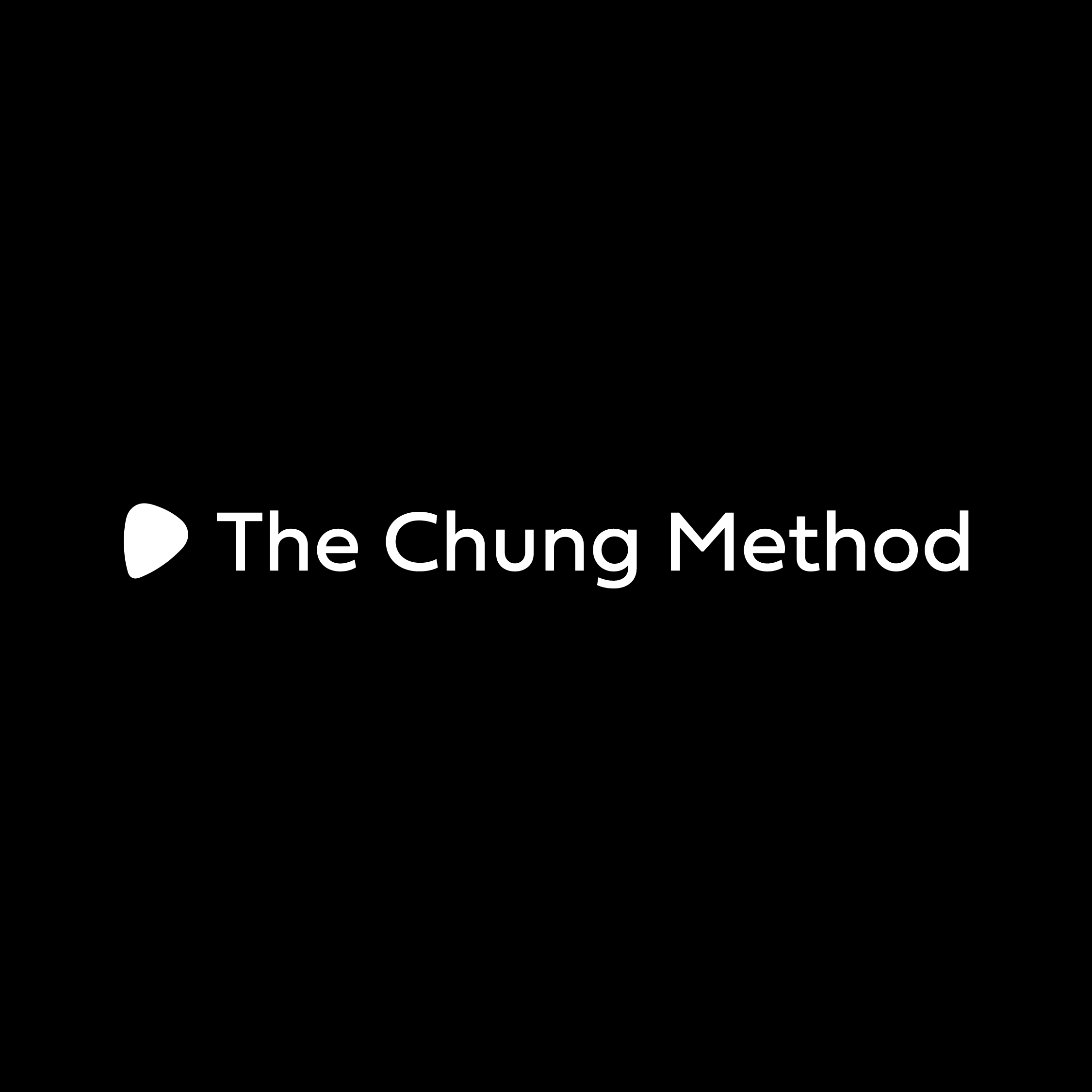
For this brief, I was asked to create a new logo for The Chung Method, whose owner decided to refine the brand by focusing on his unique process and methodical approach to music education. I thought it would be a great chance to eliminate colors, focus on the essentials, and demonstrate how straightforward and meticulous the teaching approach is. Combined with the precise, but approachable font and the charming tilted guitar pick, the logo demonstrates that music is worth exploring.


